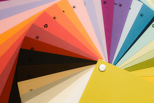
 Color plays a major role in our lives.
Don’t believe me? Think about the last time you were in a physical store that you frequent.
It likely had good aesthetics and a large part of that has to do with the selection of an appealing color scheme. The colors a store chooses should reflect both the products and the emotions the company wants to evoke from its customers. It’s about using human psychology to make a sale.
Is this all sounding a bit confusing? Not to worry. I often find starting with an example to be best.
Pink Pepto-Bismol and the Promise of Relief
Over at the Shopify blog, Humayun Khan recently wrote about color psychology as it relates to physical retail spaces. He cites a specific example that I found particularly interesting, mostly because I’d never noticed it before.
A study published in the Journal of Orthomolecular Medicine showed that seeing anything in the color pink induces a sense of calm. This causes the muscles in the body to relax as a result. This is particularly interesting because Pepto-Bismol, the pink syrup formulated to provide upset stomach relief is rather successful. Could it have something to do with the fact that the color of the product and its packaging is a color that is known to make people feel relieved?
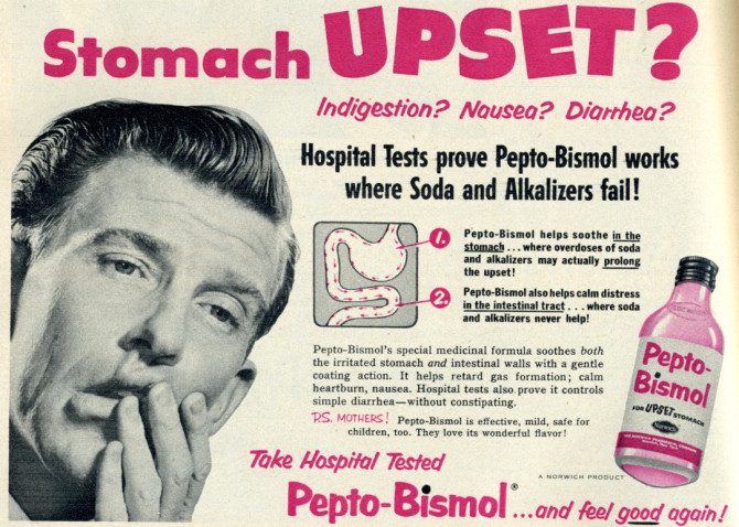 Quite possibly.
And this is just one example. For instance, blue has been shown to produce feelings of trust. And as a result, a store with a blue color scheme typically has a higher rate of customer loyalty. It’s all pretty fascinating and I could go on for hours about it. But so far, all of this talk is about how tangible products sitting on physical shelves make customers feel. It’s about how the color schemes and store design in retail locations affect sales.
So what does all of this have to do with e-commerce stores, you might be wondering? It’s a legitimate question and one that I wanted to explore more in depth here today.
Colors and Their Attributes
According to Shopio, your first step in figuring out how to approach color for your e-commerce store is to understand the various “meanings” that have been ascribed to different colors. Some of these connections have been forged rather recently but the majority have been ingrained in Western culture for generations. Here’s a brief rundown of the list they put together:
- White: Purity.
- Black: Powerful. Mystery.
- Brown: Protection. Wealth.
- Blue: Trust. Integrity. And in some cases, frigidity.
- Green: Growth.
- Yellow: Intellect. Cheerful.
- Orange: Optimism.
- Red: Exciting. Promotes action.
These color meanings have been referenced for years when companies come up with the logos for their brands. They’re also used when creating store interiors. It makes sense then that the same rules would apply when building a website. Your logo should use a primary color that matches your business’ goals. For instance, a bank might opt for green because that represents growth and prosperity. Blue would be a good option, too, because it represents trust and integrity.
You often have multiple color options when putting together a site’s design that best represents the meaning of your business. “Great!” You might be thinking. “I’ll just make everything on my website red then because I want people to buy right now!”
And while I can certainly understand that line of reasoning – especially considering the vast majority of sale signs are vibrant red – this isn’t the best approach to color use online. Allow me to explain.
Online Store Color Use Best Practices
When putting together the design for your website, it’s very important to consider not just what color(s) you use but how you use them. There are actually some best practices you need to be aware of. Here are some tried and true rules that should prove helpful when thinking about how to incorporate a target color into your design:
Beware of Overuse
There is such a thing as too much of a good thing.
Setting the background color, buttons, headers, and everything else various shades of green isn’t exactly the best approach. The site will likely be unattractive at the very least.
Color overuse can also have the opposite effect you intended when beginning the design process. The chosen color won’t stand out at all and won’t produce the right feelings in your target customer. Talk about a waste of time and effort!
Think of Strategic Placement
Using the target color where you most want to attract the site visitor’s eye is a good idea.
For instance, using it in the header text, for buttons, and for sales (both text and images) you want to draw attention to puts enough of the color on your site to illicit the emotions you want without beating customers over the head with it.
Lucrazon cites drugstore.com as a good example. The pharmaceutical and health e-commerce site uses blue in its header, main navigation, and other key areas to build consumer trust:
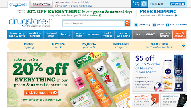 Did you notice that the shopping bag and checkout buttons are blue, too? It draws your eye because the dark blue contrasts against the white background, yes, but it also speaks on a psychological level. It tells consumers the site is trustworthy. I have a feeling that was no accident.
A Cross-Channel Strategy is Best
Even though your e-commerce site is where you’ll be making your sales, you also need to think about how you present your brand across every place it’s represented online. This means using your target color appropriately across your social media profiles, too.
Remember: it’s not just about slapping your logo on everything. Sites like Twitter, Facebook, and Google+ now offer ample space to users to create bold headers. These are an opportune place to solidify your messaging through the strategic use of color. Same goes for banner advertising. Consistency is everything.
It’s an Accessory
Using the right color(s) for your online store truly is important in terms of how your site is received. However, good products still win out at the end of the day.
What I’m trying to say is that no amount of window dressing can save a company when its products are subpar. Your primary focus should be creating (or finding) awesome things to sell. Then you can dress them up however you’d like, using the best color psychology ideas around. But without that good product to start off with, you’ll go nowhere fast.
Conclusion
Every little thing about your online store’s design is subject to scrutiny.
You might actually find yourself sitting around and pondering what color the add to cart and checkout buttons should be on your website, or what background color (if any) your site should have. Sure, you’ll think about selecting the right font and layout, too, but color plays a major role in the overall design of your online store. There’s just no questioning that fact.
So, be sure to take the appropriate time to weigh this decision carefully. It could have a direct impact on your online store’s success. Now what I want to know, is how do you use color when designing an e-commerce store? What process did you go through when making a selection? Is it something you found difficult or did it come naturally? I’d love to hear your thoughts!
Image source: thedalogs